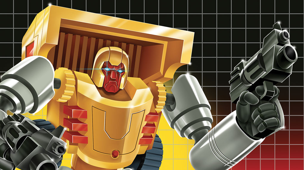
Hey guys. I just wanted to show you something kind of cool I’ve been working on recently.
As some of you may know, Philip J. Reed of BattleGrip.com has successfully received funding for a cool Kickstarter project. It’s a book called “Transforming Collections,” and it documents the world of third-party TransFormers toys.
I readily admit, I know nothing of this world of toy collecting and creating, but after seeing this video and the types of awesome figures and accessories being produced out there, I was intrigued (and I’m not even a TransFormers fan).
[pictureframe image=”https://weirdotoys.com/WeirdoToys-V2/wp-content/uploads/2013/01/sample-page.jpg” align=”center” lightbox=”false” title=”Shafter” link=”https://weirdotoys.com/WeirdoToys-V2/wp-content/uploads/2013/01/sample-page.jpg” width=”” height=””]Knowing Phil from the toy blogging world, I was excited to help with the the book – not only financially, but artistically as well. Once I saw what Phil was doing, I decided to reach out to him to see if I could be involved in some way. As it turns out, he actually had plans to include a handful of illustrations of some characters featured in the book.
The book’s illustrators include Matt Doughty, Charles Marsh, Jesse Moore, and yours truly.

Shafter (via BattleGrip.com)
I got my assignment from Phil. It was to draw a robot named Shafter.
Not knowing a thing about him and not having a toy as reference, Phil sent along some reference pics. While searching for more images and info about Shafter, I discovered the original drawing used on the box art. The red and black gradient in this pic, mixed with the classic grid lines, is definitely a throwback to the original Transformers packaging. But the drawing itself feels way too cartoony as a true tribute to the original packaging I knew as a kid.
[pictureframe image=”https://weirdotoys.com/WeirdoToys-V2/wp-content/uploads/2013/01/reference.jpg” align=”left” lightbox=”false” title=”TF art” link=”https://weirdotoys.com/WeirdoToys-V2/wp-content/uploads/2013/01/reference.jpg” width=”” height=””]
This was my chance to make one those sometimes-awkwardly airbrushed character drawings seen on the front of each TransFormers package.
The idea really excited me, but the process of creating this finessed, airbrushed look really became a challenge (pain in the ass)… so much minutia and detail.
I started with the rough sketch. Knowing I would work out all the details later, I just used this to figure out the composition, proportions and pose and all.
[pictureframe image=”https://weirdotoys.com/WeirdoToys-V2/wp-content/uploads/2013/01/shafter-sketch2.jpg” align=”left” lightbox=”false” title=”Shafter” link=”https://weirdotoys.com/WeirdoToys-V2/wp-content/uploads/2013/01/shafter-sketch2.jpg” width=”” height=””]When I first start doing the digital painting on this guy, it soon became apparent that my “imperfect” human mark making didn’t quite help with the slick, sharp style I was going for, so I bit the bullet and created this ridiculous line drawing to use as my guide for masks, coloring and airbrushing. [pictureframe image=”https://weirdotoys.com/WeirdoToys-V2/wp-content/uploads/2013/01/shafter-lineart2.jpg” align=”left” lightbox=”false” title=”Shafter” link=”https://weirdotoys.com/WeirdoToys-V2/wp-content/uploads/2013/01/shafter-lineart2.jpg” width=”” height=””]
Long story short (and days and days later) I have the final piece. I’m actually pretty happy with the old school TransFormers vibe the piece has. Sure, it’s not perfect, but I like that it has the subtle, wonky perspective and stuff. I threw the name block and Hasbo logo nod to make the TransFormers style complete. [pictureframe image=”https://weirdotoys.com/WeirdoToys-V2/wp-content/uploads/2013/01/shafter-print2.jpg” align=”left” lightbox=”false” title=”Shafter” link=”https://weirdotoys.com/WeirdoToys-V2/wp-content/uploads/2013/01/shafter-print2.jpg” width=”” height=””]
Would I do this style again? I dunno. Probably not. It was painful compared to the more painterly style I recently used on the Coptorilla painting I did last year.
Hey. At least I pushed myself and did something new.
Thanks again for having me, Phil. It’s an honor to be involved. Good luck with the book.
If you guys want to order it, put in your pre-order at the “Transforming Collections” website.


This is stupendous! I don’t own a lot of third party TF stuff but I love TF very much. You nailed this sir! Ive wanted the “huffer” version of this figure for a while now. I would love to see this in Huffer’s orange and Blue colors. Great jorb!
Awesome! The only Transformers thing I was ever into was Beast Wars. I think I just missed the boat by a couple years. Regardless, this is great.
You should do a book of illustrations based on all the weird toys you post here. I’d buy it!
I second that!
I love imperfect human drawings with style and talent like the one shown here 😀 😀 😀